t-SNE: Action Visualization
Introduction
This blog post will focus on t-SNE (t-distributed Stochastic Neighbor Embedding) as a tool for data visualization in reinforcement learning problems. We will begin by providing a quick and general overview of t-SNE, its typical applications, and how it differs from similar algorithms. Afterward, we will demonstrate its use in a standard reinforcement learning benchmark. Specifically, t-SNE will be employed to visualize the actions taken by the RL agent during training.
But first, let’s talk about the motivation behind this. Although reinforcement learning (RL) is a powerful learning framework, it has a significant challenge compared to more widely-used frameworks like supervised learning—debugging. In supervised learning, we typically have labeled datasets, controlled inputs we can visualize, and a “well-behaved” loss function that correlates with model learning. However, in RL, debugging is more complex due to the non-stationary nature of the problem, compounded by the absence of labels.
Anyone who has trained RL algorithms quickly realizes that relying solely on the cumulative reward plot can be insufficient and even misleading. It’s easy to feel lost without additional context. As a result, any extra debugging tools that can provide insight into the training process are invaluable. For example, t-SNE can help us visualize the states visited by the agent or the actions it performs. Since these are related to exploration, this visualization can offer valuable feedback, helping us determine whether the learning process is progressing or stuck, especially when other metrics may not be clear indicators.
t-SNE Overview
t-SNE is a dimensionality reduction algorithm designed to embed high-dimensional data into a lower-dimensional space, typically 2D or 3D, while preserving the relationships between points. Instead of using Euclidean distances to measure similarity, t-SNE employs probability distributions to quantify the closeness between points, where similar points are assigned higher probabilities. This probability distribution is computed both in the high-dimensional space and the lower-dimensional space. A cost function, typically KL-Divergence, is used to minimize the difference between these two distributions, ensuring that the low-dimensional map accurately reflects the relationships found in the high-dimensional data. The optimization is done iteratively, adjusting the positions of points in the low-dimensional space to best preserve the structure of the original data.
An interesting example of the power of t-SNE is its application to the MNIST dataset, as shown in Figure 1. The MNIST dataset consists of 28x28 grayscale images, which results in 784-dimensional continuous data points. Using t-SNE, these high-dimensional points are reduced to two dimensions and plotted. In the resulting visualization, we can clearly observe the formation of 10 distinct clusters, corresponding to the 10 classes in the dataset.
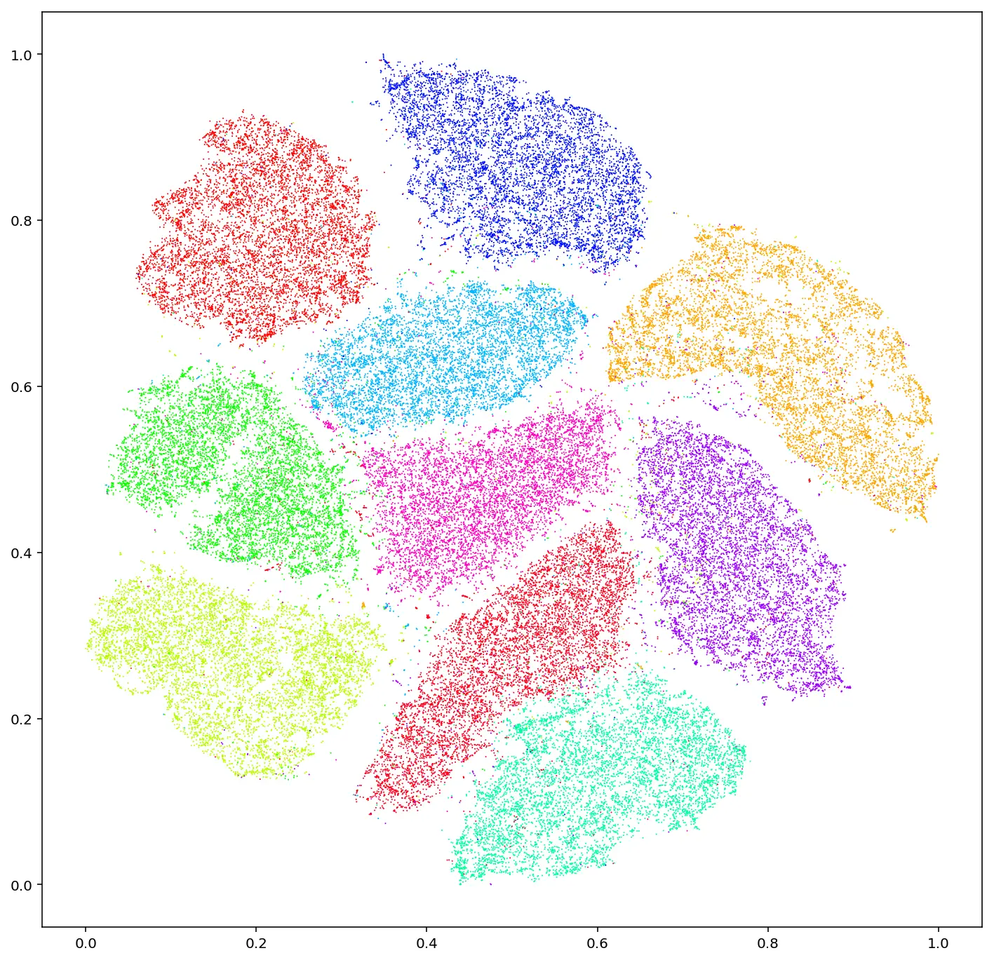 Figure 1: T-SNE embeddings of MNIST dataset. (link)
A common tool for data visualization, alongside t-SNE, is Principal Component Analysis (PCA). Both algorithms can reduce the dimensionality of high-dimensional data, but they differ in two key ways.
First, PCA creates a mapping between high-dimensional and low-dimensional spaces based on a global covariance matrix. After applying PCA to a dataset, we can use this matrix to reduce the dimensionality of similar data. Additionally, PCA allows for the possibility of inverting the matrix to reconstruct the original data, though with some limitations. These capabilities are not available with t-SNE, largely due to its iterative nature.
Second, t-SNE is capable of nonlinear dimensionality reduction, meaning it can separate data that cannot be divided by straight lines, planes, or hyperplanes—something PCA is not capable of. This is a significant advantage of t-SNE over PCA.
Experimental Setup
The environment chosen to evaluate t-SNE is the Ant Gymnasium environment. We selected this environment because it can be solved using standard reinforcement learning algorithms, while also featuring a relatively high-dimensional action space (8 dimensions), making it a suitable candidate to demonstrate the utility of t-SNE for dimensionality reduction.
The goal of this environment is for an ant-like quadruped to learn to walk in a straight line (along the x-axis, for example). The agent controls the torque applied to each of the ant’s joints at every time step. Each leg has two joints—one at the body and one at the knee.
The observation space has 27 dimensions. The agent receives oracle-style information about its absolute position and velocity, orientation, joint angles, and angular velocities.
The action space consists of 8 dimensions, where the agent controls the torque applied to each joint at every time step. The torque for each joint is bounded between $[−1,1]$ N·m.
The reward function provided by the environment is composed of three components. First, a healthy reward that rewards the agent for staying “alive.” In this case, staying alive means that the z-value of the agent’s center of mass must remain within the bounds $[0.2,1]$. Second, the forward reward calculates the agent’s velocity along the x-axis. Lastly, the control cost penalizes the agent based on the square of the actions (the applied torques). In control theory, this cost is often related to minimizing energy consumption.
Train Results
To enhance the understanding of the t-SNE results, we should present some evidence demonstrating that the training process was successful.
We trained three iterations of SAC with identical hyperparameters until convergence. The average returns for these iterations are shown in Figure 2.
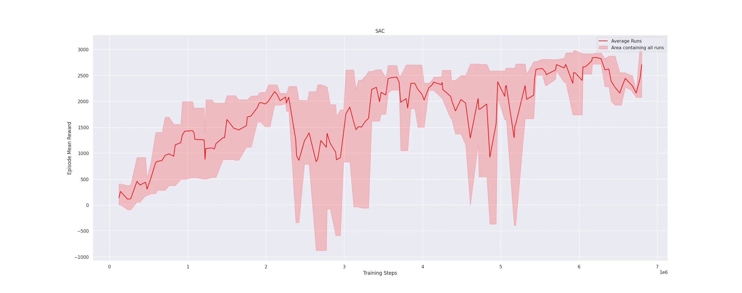 Figure 2: Mean returns for the 3 train sessions
The plot is somewhat sparse since three iterations is a relatively small sample size. However, it is clear that all iterations converge to a total episode reward of around 3000. Each episode is truncated at 1000 timesteps, with the agent receiving a reward of 0.5 per timestep for remaining alive. Therefore, the difference between 500 and 3000 is attributed to the agent’s velocity along the x-axis. This suggests that the task is, to a large extent, successfully completed. Additionally, we provide a video of the agent’s performance during the final steps of a training iteration to qualitatively verify task completion.
t-SNE Results
Now that we have trained our model, we are able to analyze the plots generated by the t-SNE algorithm. During training, we periodically recorded episodes of the agent performing the task. Since the training spanned approximately 7 million steps, we paused every 50,000 steps to capture data for t-SNE visualization. It is important to note that the length of each episode varies due to truncation; episodes that do not reach the truncation limit extend up to 1000 steps. Given that around 25 episodes were recorded, this resulted in roughly 25,000 data points—an amount potentially too large for t-SNE to process effectively. To address this, we opted to focus only on the final N actions of each episode, arbitrarily selecting the last 150 actions for analysis.
The first plot of interest is the t-SNE projection where points are color-coded according to the training progression (see Figure 3). It is worth noting that the visualization contains a significant amount of information, so we will unpack it step by step. The most prominent feature is a large cluster of actions in the center. While this cluster is not homogeneous, appearing to consist of smaller sub-clusters, it suggests that the agent frequently performs a core subset of actions throughout training. One possible interpretation is that the policy initialization already places the agent partially within the task-relevant subspace (i.e., the subspace that aligns with successful task execution). This observation is significant as it implies that certain actions are shared across both well-performing (final) and poorly-performing (initial) agents. This interpretation naturally leads us to examine the smaller clusters. Four distinct clusters are evident in the early stages of training, which reduce to two in the intermediate stages, and eventually reduce into a single solid cluster in the later stages. The separation of these smaller clusters is indicative of an exploration phase in reinforcement learning, while their consolidation suggests a transition from exploration to exploitation. However compelling these observations may be, further training sessions yielding similar results would be required to substantiate these hypotheses. However, the fact that the t-SNE compression is not random indicates that meaningful patterns are emerging.
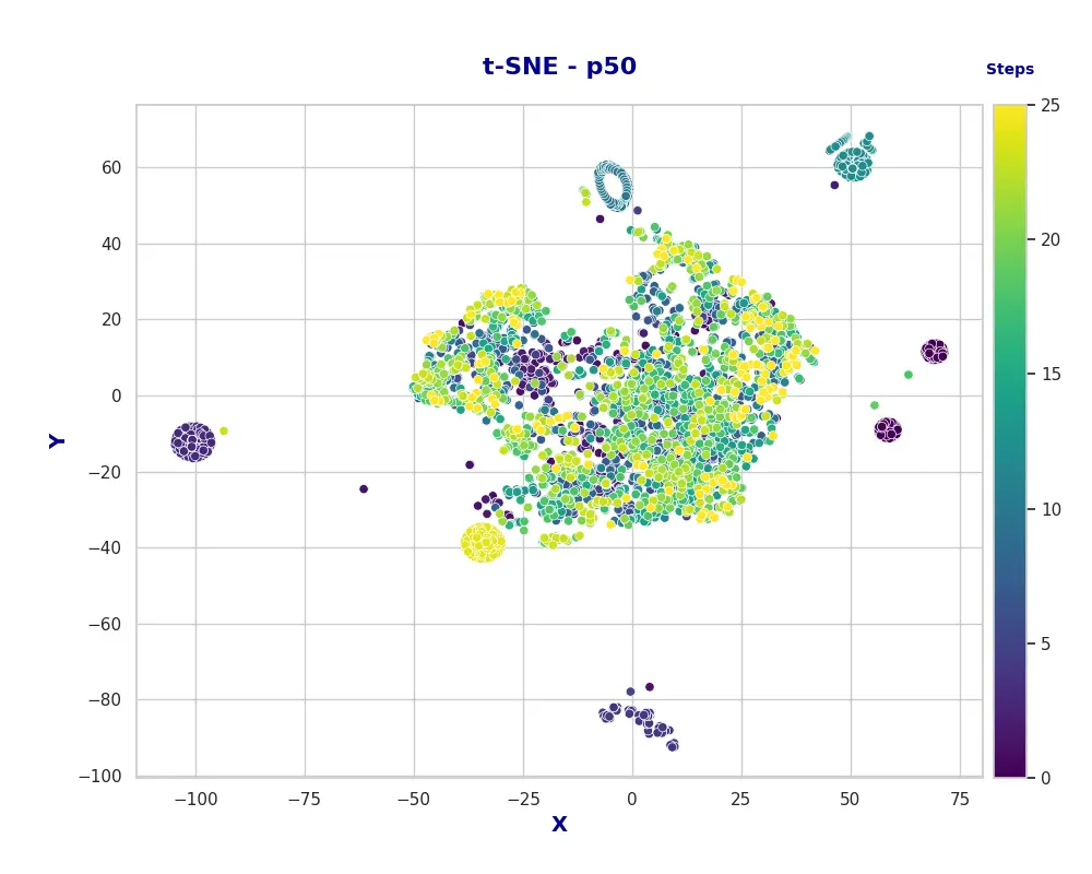 Figure 3: t-SNE plot for the actions with respect to the train session
An alternative perspective is to plot the same t-SNE points, but color them based on the cumulative reward obtained in the respective episodes. This visualization also reveals interesting insights. Specifically, the large central cluster—which previously contained actions from episodes at all training stages—now primarily comprises actions from episodes with a cumulative reward above 750. This suggests that this cluster represents fundamental actions necessary for completing the task, while the smaller clusters are associated either with suboptimal actions that hinder performance or with highly effective actions that enable optimal task execution.
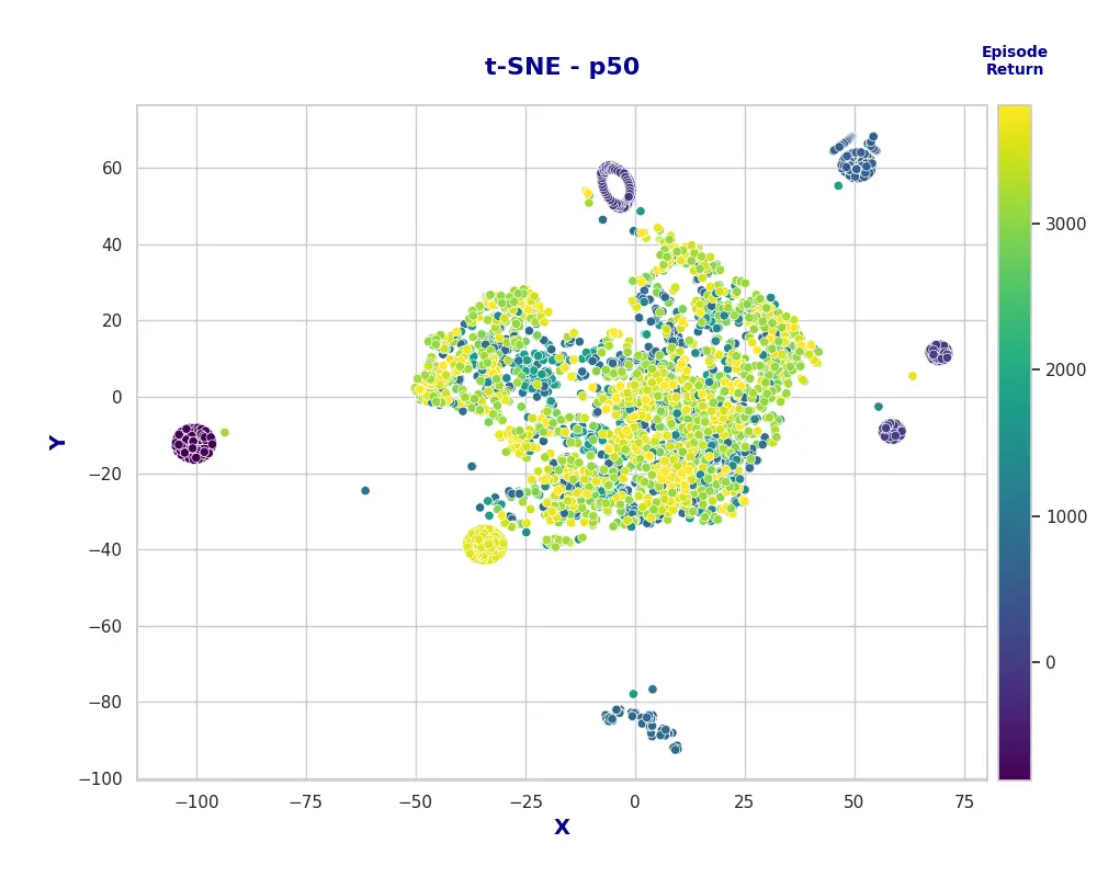 Figure 4: t-SNE plot for the actions with respect to the total episode reward
Lastly, for the sake of visualization, we explored whether projecting the data into 3D space could improved interpretability or reveal different structures. Interestingly, the 3D projection yields similar clusters, spaced accordingly in three dimensions. An interactive visualization is provided to allow for further exploration of these results.
Discussion
Firstly, we would like to acknowledge that a topic as extensive as this one needed a more in-depth analysis and thorough testing than we have performed here. We have merely scratched the surface of t-SNE’s capabilities. Nonetheless, we anticipate that t-SNE will feature more prominently in future blog posts as an additional lens for analysis and interpretation.
It is also worth noting that t-SNE has several hyperparameters that influence the quality of the visualization (e.g., perplexity, which we have not discussed here). Extracting meaningful visualizations can be challenging given the volume of data and the hyperparameters chosen. According to the documentation we reviewed, the recommended approach to overcome this challenge is to iteratively experiment with different parameter settings to determine what works best. Consequently, there may be an adjustment period while developing an intuition for how to effectively utilize this tool. It is important to remember that the computational time and memory required for t-SNE scale quadratically with input size, which can quickly impose practical limitations on our analysis.
For transparency, we should also mention that, of the three training sessions conducted, the results presented here were the most expressive, with diverse mini-clusters and rich interpretations. The visualizations from the other sessions were less nuanced, tending to form a large central cluster with fewer distinct sub-clusters. However, this particular training session also achieved higher returns, which may account for its greater expressiveness.
